Vanguard · Personal investor
Making a Portfolio Feel Like One Account
Balances, activity and money movement for three account types in one calm place — and a vocabulary that answers “where is my money?” before anyone has to call.
A note on what you're seeing. I take my clients' confidentiality seriously. The artifacts on this page are re-creations and abstractions of the real work, and the numbers are illustrative of project outcomes rather than audited figures. Happy to walk you through the genuine article — just ask.
The situation
People don't want to manage accounts. They want to know they're okay — and a screen per account type is the wrong shape for that question.
A personal investor at Vanguard can easily hold a retirement account, a brokerage account and a college-savings plan, each of which had grown up with its own screens, its own activity view and its own words for the same thing. Moving money between them meant visiting three places and trusting three different statuses. The single most common reason to call was “where is my money?” — asked by people who had done everything right.
The brief was account management, which is a modest phrase for a hard problem: make a portfolio of unlike things feel like one account without pretending the underlying accounts are the same.
My role
I was the UX designer on the account-management stream — mapping the money movement end to end, designing the unified views and the transfer flow, writing the state vocabulary, and running the usability rounds that decided which words stayed.
The process
Beat one
Mapping the money
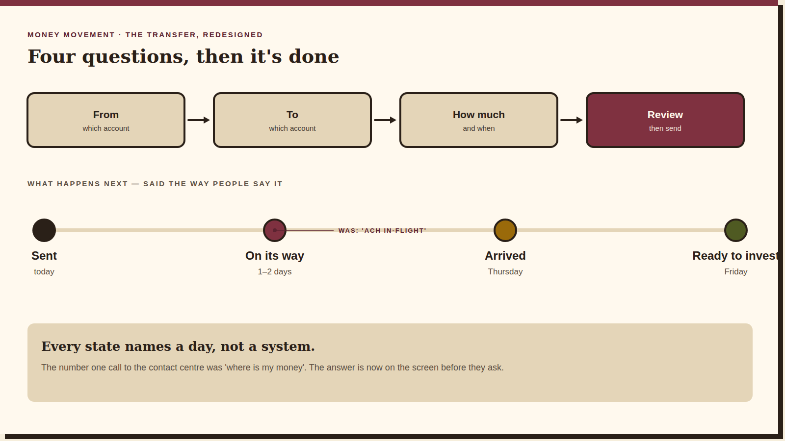
Before any screens, a journey map of a single transfer as the investor experiences it: from one account to another, through settlement, to the moment the money is usable. Laid out that way the problem stopped being “three screens” and became “six unexplained days”. Every design decision after that was about explaining the days.
Beat two
One ledger
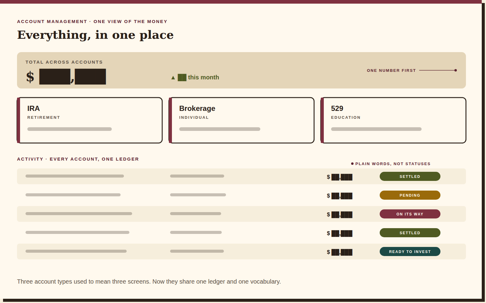
The three account views collapsed into one activity ledger with the account as a column, not a destination. The headline total comes first, the per-account tiles second, and the ledger runs across all of them — so a transfer is one row that changes state, rather than a departure on one screen and an arrival on another.
Beat three
Money movement, in plain words
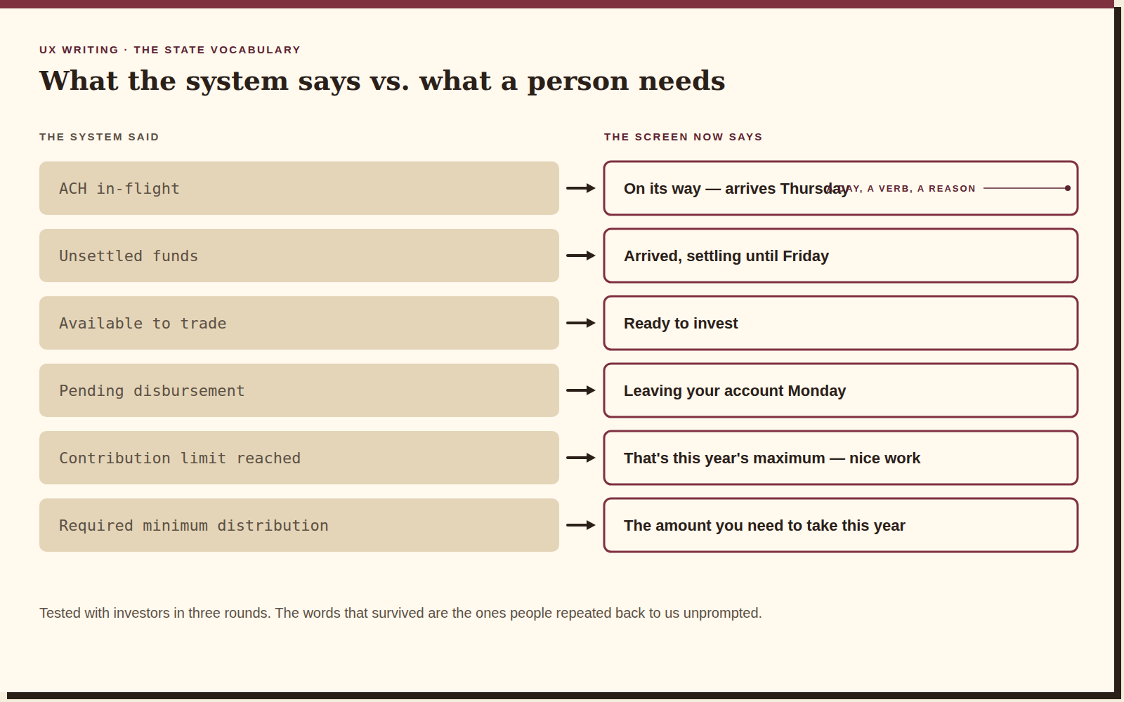
The transfer flow became four questions — from, to, how much, review — and then a timeline of what happens next, said the way people say it. “ACH in-flight” became “on its way — arrives Thursday”. Every state names a day, a verb and a reason. That vocabulary was the real deliverable; the flow just carries it.
Beat four
Testing with investors
Three rounds of moderated studies with real investors, each round a vocabulary bake-off as much as a usability test. We measured task success, but the number I watched was confidence: after completing a transfer, did people believe it had worked? That is the metric a contact centre feels.

1 ledger*
The outcome
Three account types, three activity views and three vocabularies became one ledger and one set of words. The transfer flow shipped with the state timeline, and the vocabulary was adopted as a writing standard beyond the account-management screens. The thing I'm proudest of is a sentence: “on its way — arrives Thursday”.
Reflection
“Nobody wants to manage accounts. They want to know they're okay.”
Finance UX has a habit of exposing the system's own vocabulary and calling it transparency. It isn't; it's homework. What I'd do differently: bring the contact-centre team into the first workshop instead of the third. They knew exactly which six words were causing the calls, and it took us a month to find them on our own.