Travelers · Customer portal
One Portal, One Way Around
A navigation model that could carry policies, claims, billing and help without collapsing — presented, argued for, and carried forward.
A note on what you're seeing. I take my clients' confidentiality seriously. The artifacts on this page are re-creations and abstractions of the real work, and the numbers are illustrative of project outcomes rather than audited figures. Happy to walk you through the genuine article — just ask.
The situation
Insurance portals accrete features until nobody can find anything.
Navigation is invisible when it works and infuriating when it doesn't. Travelers needed a global model that could carry policies, claims, billing and help for millions of customers — and keep carrying them as the portal grew, which portals always do. The failure mode isn't a bad menu. It's twenty good decisions made separately over five years.
Add to that: people don't visit an insurance portal casually. They arrive because something happened. Whatever the navigation does, it has to work for someone who is stressed, in a hurry, and has never used the site before.
My role
I owned the information architecture and interaction design for global navigation across the portal, plus proposals for the transactional and Help surfaces that hang off it — grounding the work in customer research and building the case with stakeholders through iterative proposals.
The process
Beat one
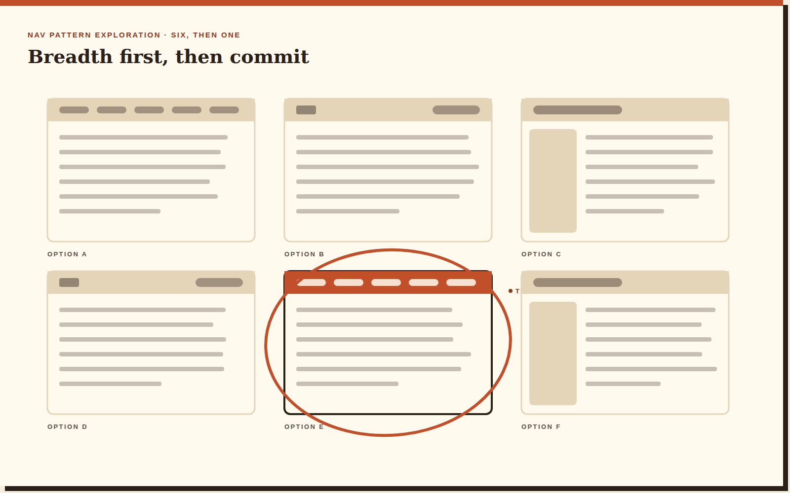
Research-grounded ideation
Customer research in, design exploration out. The research mostly confirmed something uncomfortable: people navigated by search and by guessing, because the menu described the company's org chart rather than their problem.
Beat two
The navigation model
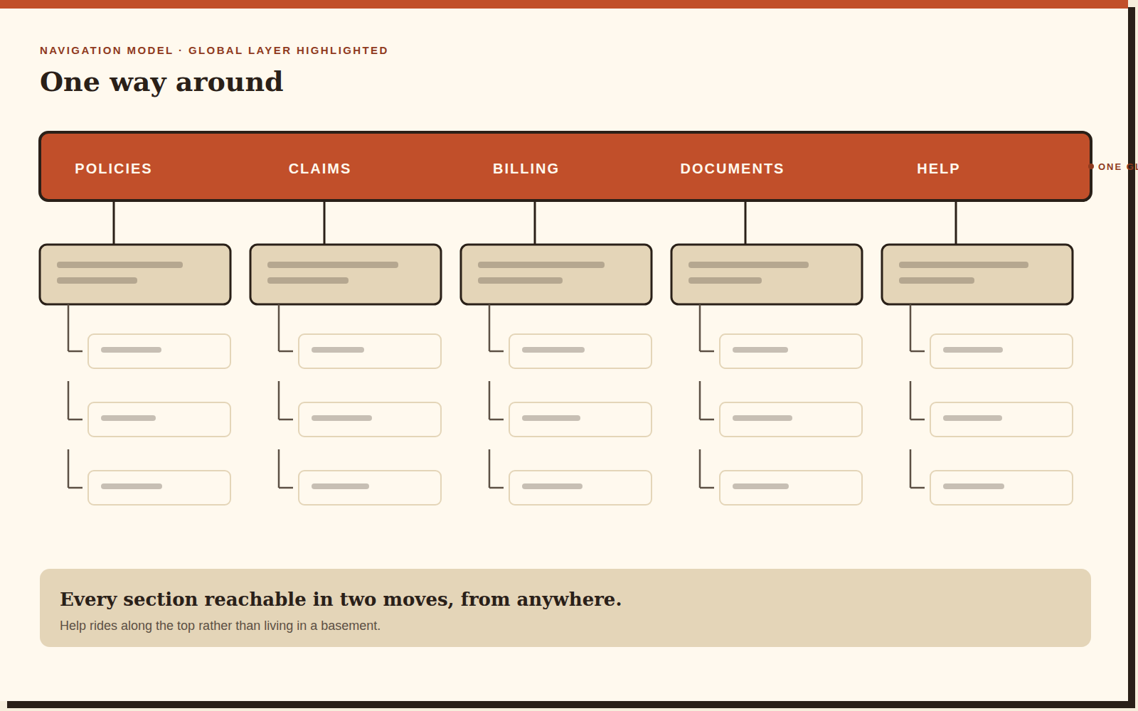
Five top-level sections, everything reachable in two moves from anywhere, and Help promoted from the basement to the top bar. That last one was the fight worth having: Help had historically been treated as a failure state rather than a feature.

Beat three
Transactional and Help UI
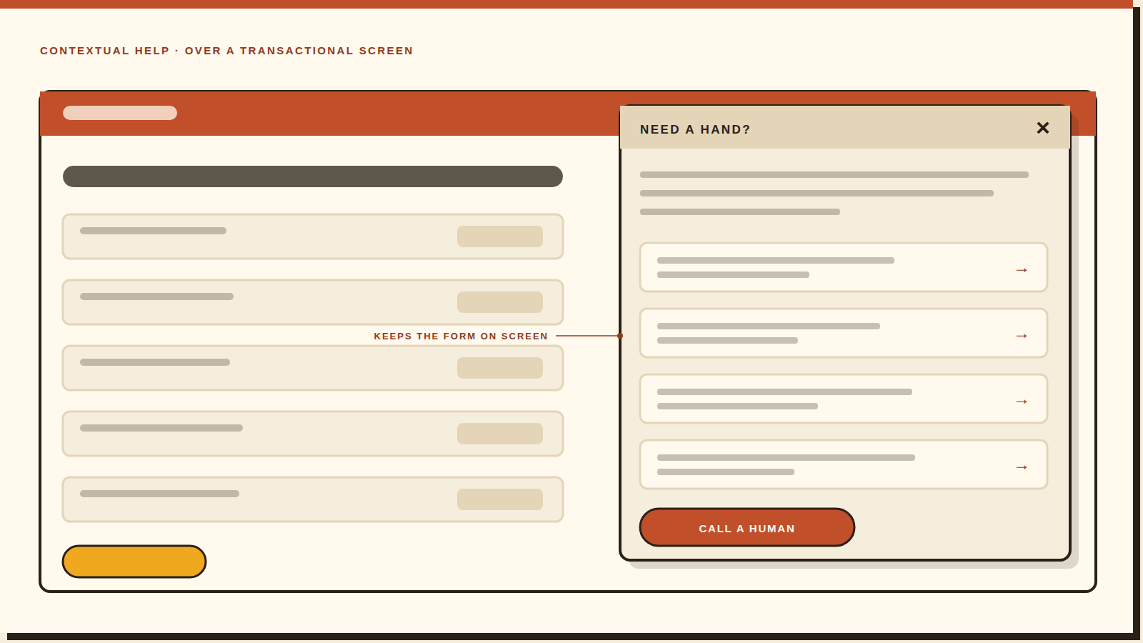
Proposals for the moments users are most stressed: filing, paying, and asking for help mid-task. The rule we settled on was that help never takes the screen away from you — you should be able to read the answer and see the form you were stuck on at the same time.
Beat four
Presenting up
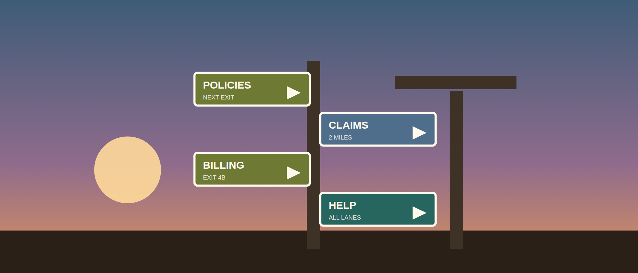
Building the case with stakeholders through iterative proposals. Navigation work is unusually political because every team believes their section belongs in the top bar. The way through is to keep showing the customer's path rather than the company's structure.
2*
The outcome
Two moves to anything, from anywhere in the portal. A coherent navigation model and a set of Help experience proposals, presented and carried forward — clarity delivered, rather than a metric I can't verify for you.
Reflection
“Nobody compliments a navigation system. That's how you know it's working.”
The work I'd extend is governance. A navigation model is only as good as the rule that stops the next team from adding a seventh top-level item. Designing the menu is a season's work; designing the process that protects it is the thing that makes it last.